Comparing and Clustering the Neighborhoods of New York City and Toronto

Introduction
In this post, I will talk about a project I’ve done in order to get IBM Data Science Professional Certificate. In this project, the neighborhoods of two important cities in the world—New York City (NYC) and Toronto—were clustered into groups of similar items. One can use the results of this analysis to understand the similarities and differences between the two cities neighborhoods.
The clustering will be based on the types (categories) of venues in the neighborhoods. Each of the resulting clusters should have neighborhoods that contain similar distribution of venues. For example, one cluster may contain neighborhoods that have many Italian restaurants, many coffee shops, and few medical centers; another cluster may contain neighborhoods with many residential buildings, many barbershops, and few Italian restaurants.
This post will explain the stages and results of this project broadly. For a more in-depth description, check the project report. The code used to perform this project is available as a Jupyter notebook.
Data Acquisition and Preparation
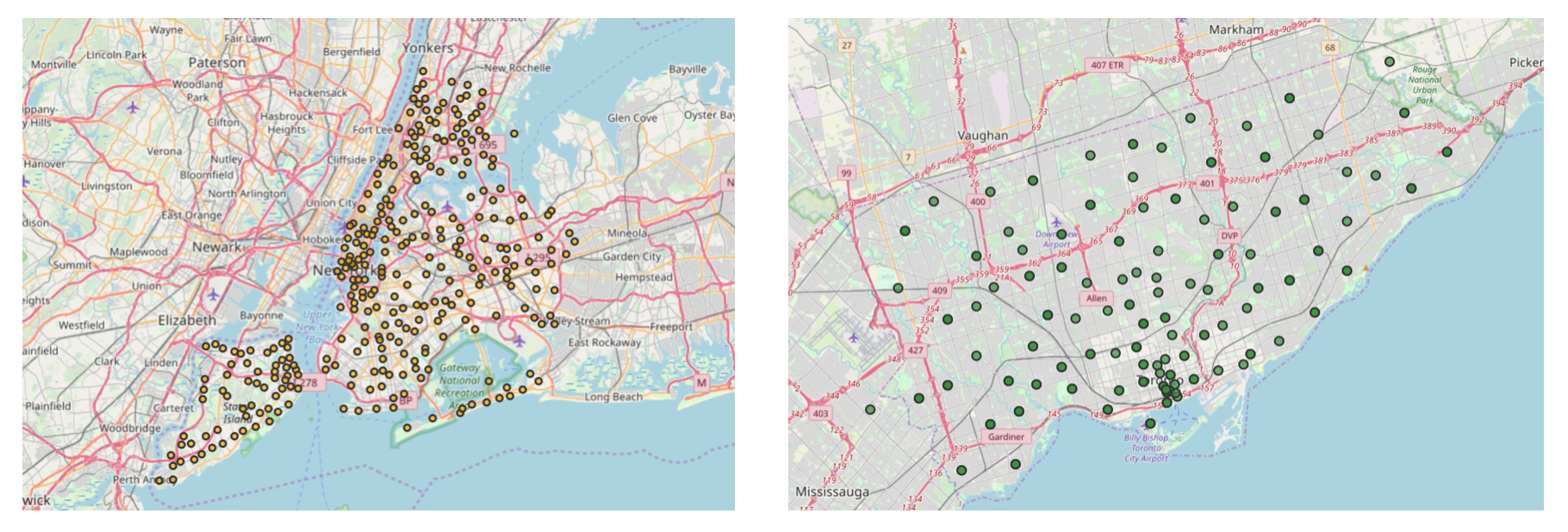
Since clustering will be based on the categories of venues in the neighborhoods, we need data that specifies the venues in the neighborhoods and their categories. Of course we, in the first place, need a list of the neighborhoods of NYC and Toronto.
The figure below shows a map of NYC with its neighborhoods represented as orange circles on the left side and a map of Toronto with its neighborhoods represented as green circles on the right side.
To acquire data on venues and their categories, Foursquare API is used. Foursquare is one of the world largest sources of location and venue data. To retrieve the venues and their categories in a given neighborhood, the coordinates—the latitude and the longitude—of the neighborhood are sent in the API request. The API-request URL looks like the following:
https://api.foursquare.com/v2/venues/search? &client_id=1234&client_secret=1234&v=20180605& ll=40.89470517661,-73.84720052054902&radius=500&limit=100
where search indicates the API endpoint used, client_id and client_secret are credentials used to access the API service and are obtained when registering a Foursquare developer account, v indicates the API version to use, ll indicates the latitude and longitude of the desired location, radius is the maximum distance in meters between the specified location and the retrieved venues, and limit is used to limit the number of returned results if necessary.
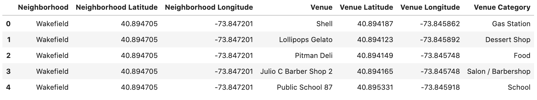
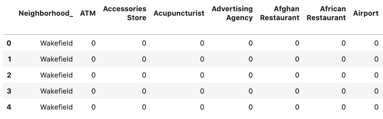
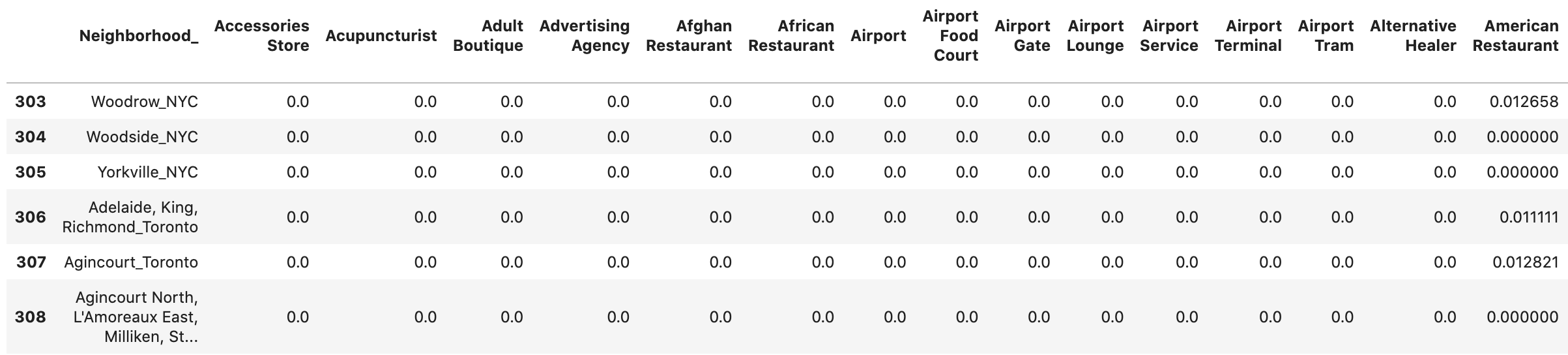
The result of this data-acquisition-and-preparation stage is two tables (dataframes) that specify the neighborhoods and the venues of each of NYC and Toronto. Below is a part of the NYC table. In these tables, one neighborhood might take many rows depending on the number of retrieved venues for that neighborhood.
Several data-preparation techniques were used to arrive at this table. The details are all specified in the project report.
Exploratory Data Analysis
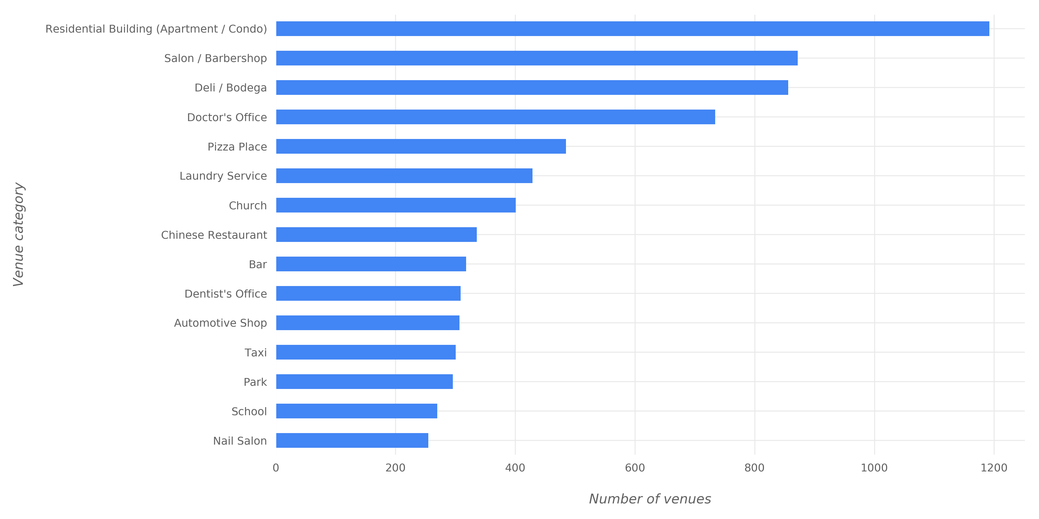
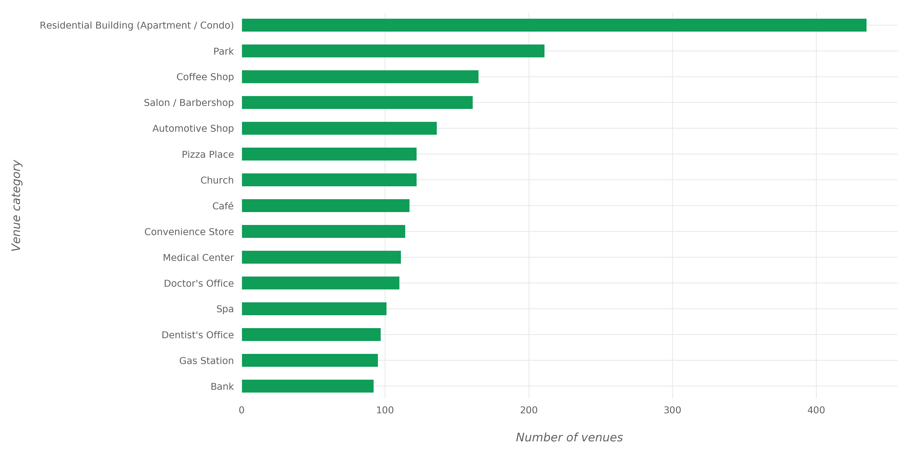
To get a better understanding of the venues data, we performed some exploratory analysis. In this analysis, we found the most common and the most widespread venue categories in NYC and Toronto.
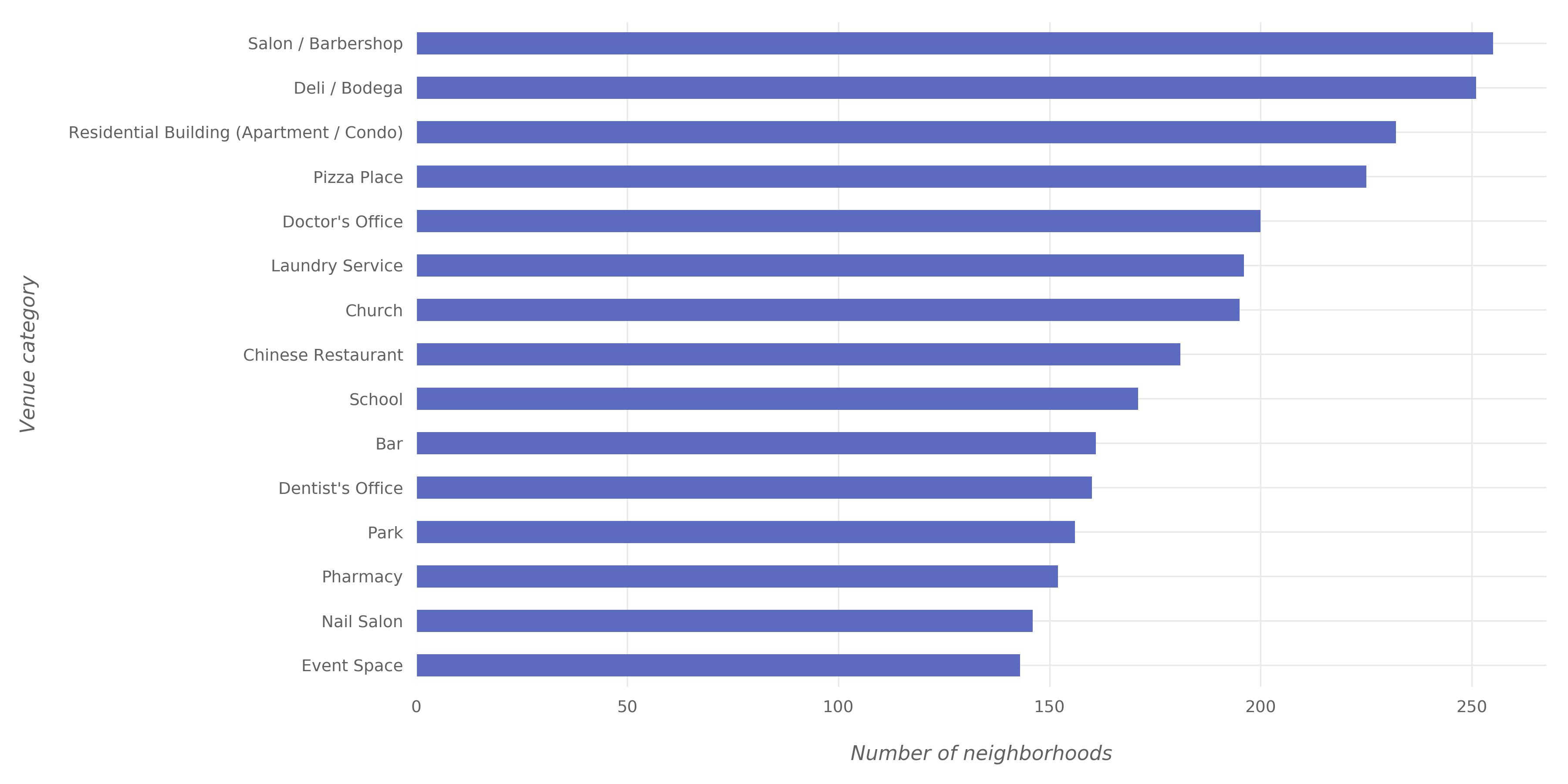
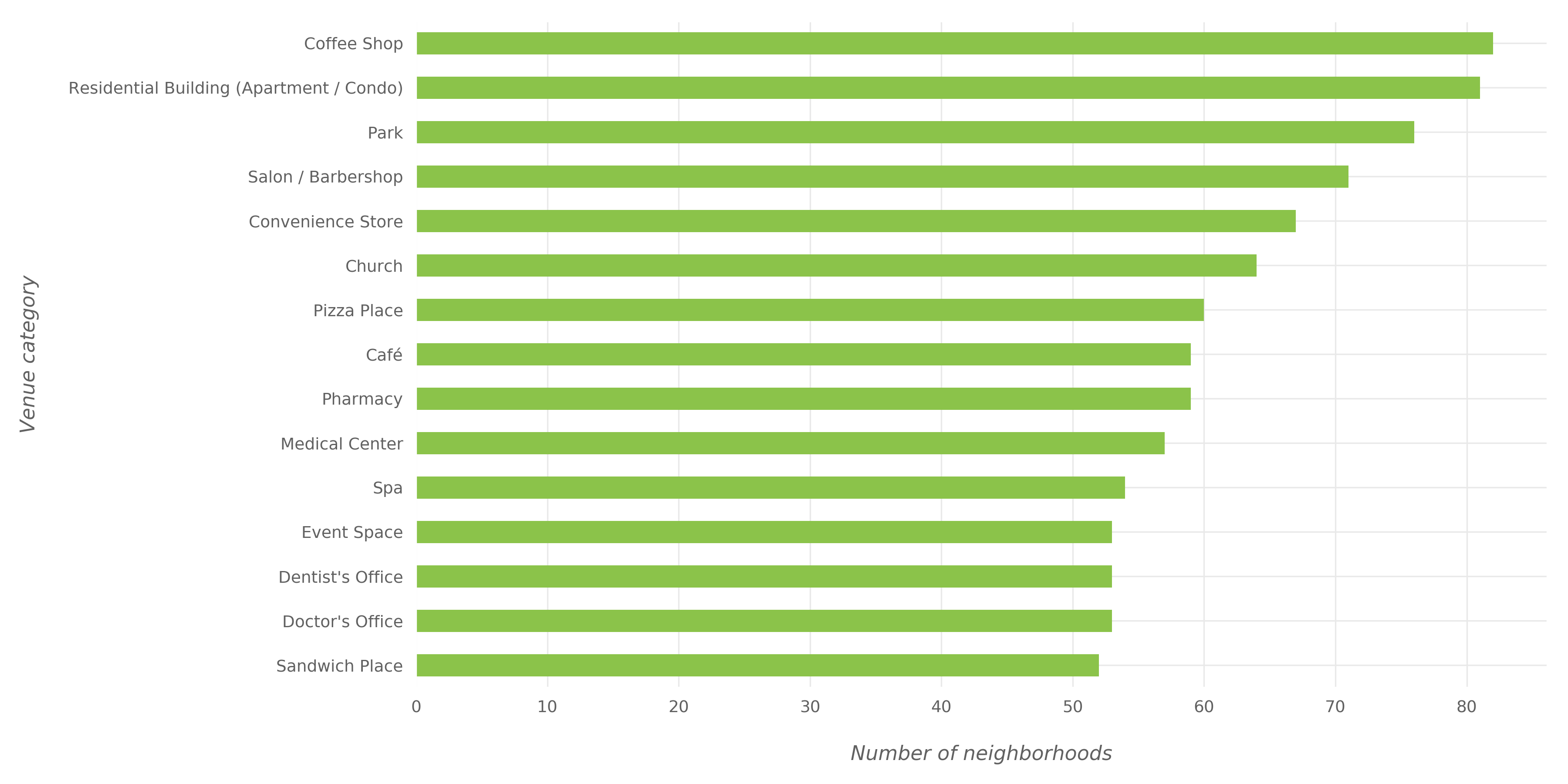
To explain the difference between “most common” and “most widespread”, we use an example: Suppose that there are 15 venues with the category “VR Games” and that these venues exist in 7 neighborhoods only out of 80 neighborhoods; also suppose that there are 10 venues with the category “Syrian Restaurant” and that these venues exist in 10 neighborhoods—each one of them in a different neighborhood. Then it can be said that the “VR Games” category is more com- mon than “Syrian Restaurant” category because there are more venues under this category, and it can be said that the “Syrian Restaurant” category is more widespread than the “VR Games” category because venues under this category exist in more neighborhoods than the other category.
Note: Before proceeding with exploratory data analysis and the subsequent steps, a data-preparation operation was performed: venues whose category is “Building”, “Office”, “Bus Line”, “Bus Station”, “Bus Stop”, or “Road” were excluded because they are not expected to add analytical value in this project.
The figures below shows the most common venue categories in NYC.
The figures below shows the most common venue categories in Toronto.
The figures below shows the most widespread venue categories in NYC.
The figures below shows the most widespread venue categories in Toronto.
Clustering of Neighborhoods
To perform clustering, we need to feed the clustering algorithm with features in appropriate format. The data format that we saw above—show also below—is not suitable for the clustering algorithm.
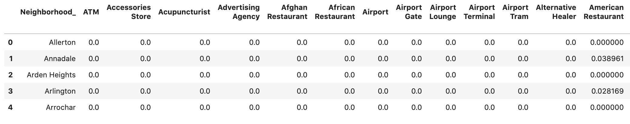
Since that we care most about the categories of the venues in the neighborhoods, one-hot encoding will be performed on the “Venue Category” field in the dataframe (table) shown above. A sample of the resulting dataframe of NYC is shown below.
The next step is aggregating the values for each neighborhood so that each neighborhood becomes represented by only one row. The aggregation will be done by grouping rows by neighborhood and by taking the mean of the frequency of occurrence of each category. So for example, if the Fieldston neighborhood has 15 venues (i.e. 15 rows in the dataframe shown above) and 4 of these venues are of the “Sandwich Place” category, then Fieldston row in the aggregated dataframe will have the value 4/15 = 0.27 for the “Sandwich Place” column. The figure below shows the aggregated dataframe of NYC.
Now, we have two aggregated dataframes, one for NYC and another for Toronto. The next step is combining these two dataframes together while adding a suffix to the names of the neighborhoods to still be able to distinguish between NYC neighborhoods and Toronto neighborhoods. The figure below shows a sample of the combined dataframe.
After that, clustering is applied. The clustering algorithm used is the K-means algorithm of Scikit-learn package and number of clusters is chosen to be 5 clusters. The output of clustering is a label for each neighborhood indicating to which cluster this neighborhood belongs. The figure below shows a sample of a dataframe created with the cluster labels.
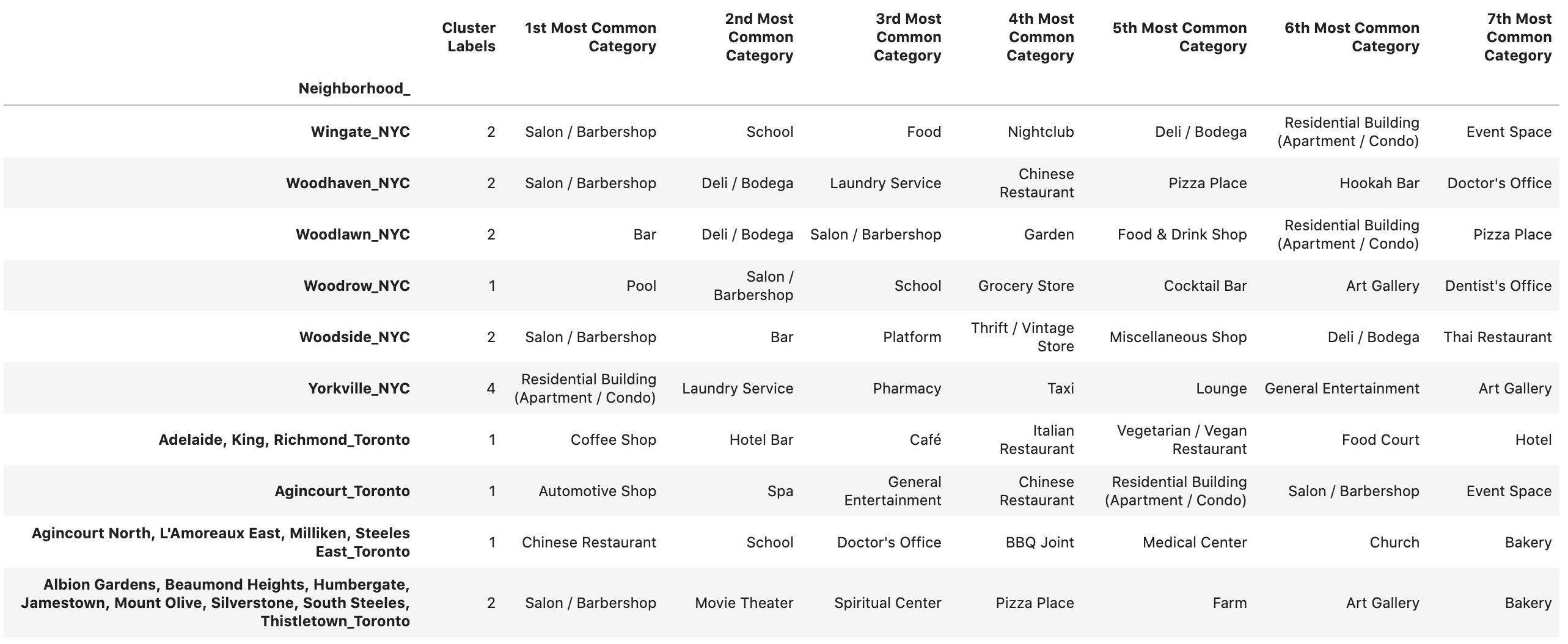
We added columns that show the most common venue categories in each neighborhood along with its cluster label.
Cluster Analysis
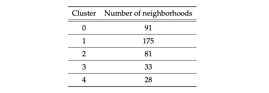
The table below shows the number of neighborhoods in each cluster.
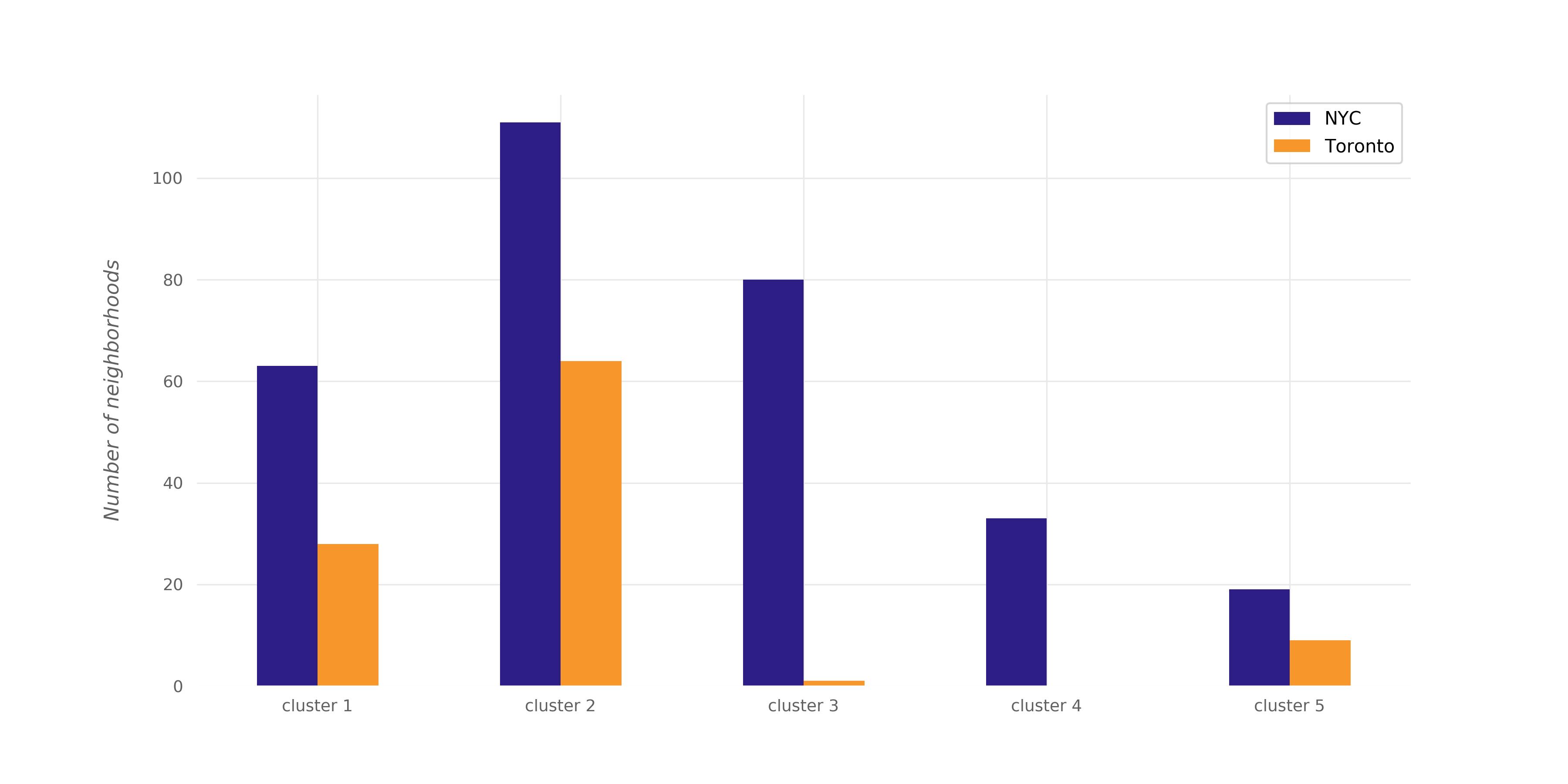
And the plot below shows the number of NYC neighborhoods and the number of Toronto neighborhoods in each cluster.
The tables below show the most common venue categories in the neighborhoods of each cluster with the percentage of venues for each category.

The differences between the clusters can be seen from the figure; each cluster distinguishably has different distribution of common venue categories than other clusters. Some of the observations that can be made are:
- While residential buildings constitute ~9% of venues in the neighborhoods of the first cluster, they constitute ~2% of the venues in the second and third clusters, ~4% of the venues in the fourth cluster, and 21% of the venues in the fifth cluster.
- Pizza places appear in the most common categories of the second, third, and fourth clusters only.
- Chinese restaurants appear in the most common categories of the third cluster only.
- Automative shops appear in the most common categories of the second cluster only; moreover, “Automative Shop” is the most popular category in that cluster.
- Doctor and dentist offices constitute ~18% of fourth-cluster venues while they constitute only 2% of each of the second-cluster and fifth-cluster venues.
Other differences can also be observed.
To see the full detailed report of the analysis, click here, and to access the Jupyter notebook that contains all the code used in this project, click here.