How to Create Beautiful Plots with matplotlib
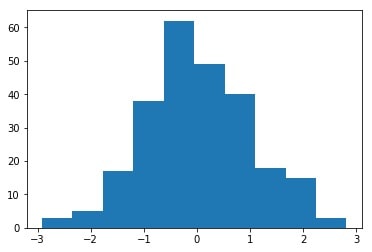
Python is one of the main tools in the data science world today. Python has many packages and libraries for plotting. Matplotlib is one of the most used packages for plotting. However, the default plots are not that beautiful, in my opinion at least. Take a look below to see a plot produced with the default settings:
In this post, I will share my way in producing beautiful plots with Matplotlib.
We will start with a plot produced with default settings. We will use the following code to generate some data and produce a histogram plot:
import numpy as np
from matplotlib import pyplot as plt

%config InlineBackend.figure_format = 'retina'

np.random.seed(3)
x = np.random.randn(250)
plt.hist(x);
This gives us the following plot:
Now we want to improve this plot by using some of the options provided by Matplotlib.
Figure size
The default size of a Matplotlib figure (which is the space on which plots are drawn) is 6 x 4 inches. This is sometimes not big enough for your plot. To change that, we create a figure with our desired dimensions then we plot what we need to plot. For example:
fig, ax = plt.subplots(figsize=(8, 5.5))
plt.hist(x);
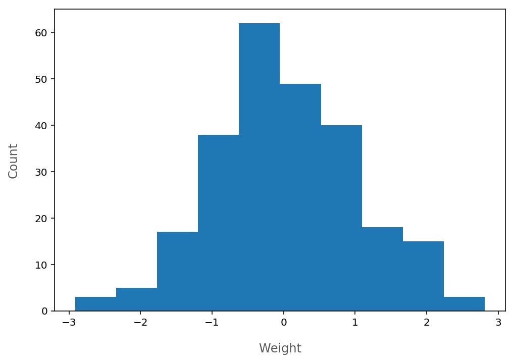
Axis labels
As seen in the default plot, there are no labels on the x-axis and y-axis. Sometimes we need labels so we can know what each axis represents. We can set the labels as follows:
ax.set_xlabel("Weight", labelpad=15, fontsize=12, color="#333533");
ax.set_ylabel("Count", labelpad=15, fontsize=12, color="#333533");
We labeled the x-axis with "Weight" assuming that our data represents weights of people. We set the space between the x-axis and the label to 15pt so it is not so close to the axis. Also, we made the label a little bit bigger (the default size is 10pt), and we chose a somewhat gray color for the label so it doesn't distract the reader from the plot. Similar things were applied to the y-axis. The result is:
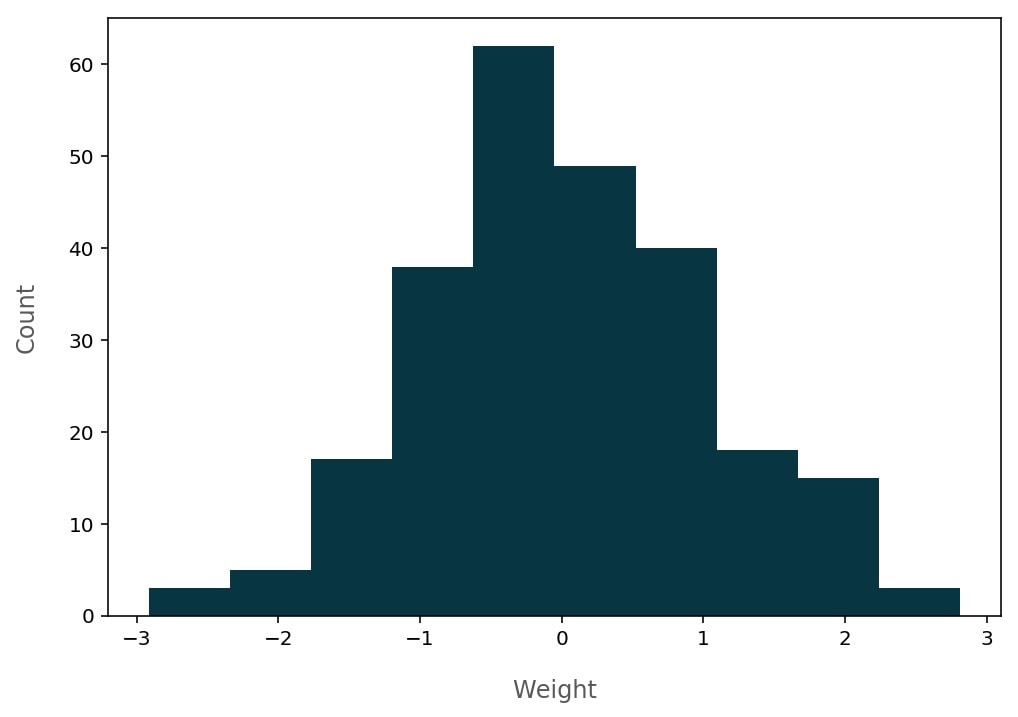
Colors
With Matplotlib, we can change the color of a lot of objects. In our example, we can change the color of the histogram, the color of the background inside the axes and outside the axes, the color of the text, etc.
We will use the same command we used before to plot the histogram but with a parameter that specify the color:
plt.hist(x, color="#073642");
This results in the following graph:
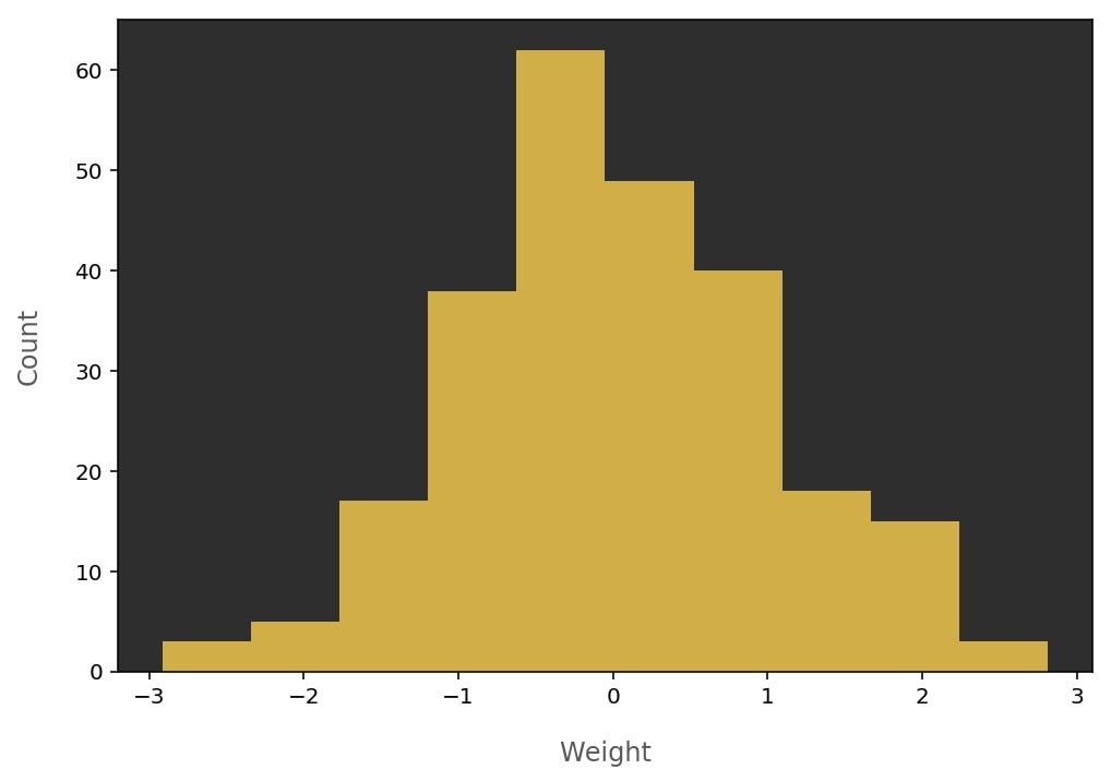
Or you might go for something like the following:
plt.hist(x, color="#d1ae45");
# to change background color inside the axes
ax.set_facecolor("#2E2E2E")
which produces this graph:
Matplotlib plot system
To be able to customize the plot, it is important to know the plotting system of Matplotlib. In Matplotlib, everything is plotted and written on a figure. A figure might contain more than one plot (subplots). A plot is represented as axes that contain the desired shape (histogram, scatter plot, etc.). You can control a lot of things in Matplotlib by working with these three items: the figure, the axes, and the shape which you can customize it using its corresponding function (for example, when we plot a histogram using plt.hist(data) function, we can specify the color of the histogram with plt.hist(data, color="darkblue"). There are many other parameters to play with ).
Personally, I create my Matplotlib plots using something like this:
fig, ax = plt.subplots(figsize=(10, 7))
ax.hist(data, color="#333333")
This gives me the fig and ax objects with which I can control many aspects.
Grid
Sometimes we need a grid in our graph to make it easier to read. The following code draws a grid with a light gray color so it does not distract the reader.
# The following line is to prevent the grid
# from appearing on the histogram
ax.set_axisbelow(True)
# alpha is used to control the transparency
plt.grid(True, color="#93a1a1", alpha=0.3)
The result can be seen below:

Color combinations
Some types of visualizations can be made with more than one color. For example, pie charts, bar charts, a plot with more than one histogram on it, etc. In this case, choosing the colors for the plot becomes more effective in determining the beauty of the plot. There are a lot of websites that show many beautiful color combinations. For example, http://colorhunt.co/, https://coolors.co/browser/best/1, https://flatuicolors.com/, etc. There are also websites that suggests colors specifically for data visualization like https://learnui.design/tools/data-color-picker.html and http://tristen.ca/hcl-picker. Here are some examples from a previous data analysis I've done:
Don't repeat yourself
If you have particular settings that you want to apply to all of your plots, you can use Matplotlib rcParams to do so. Changing the settings of rcParams will affect all subsequent plots. For example, if you want all plots to have the size 12 x 8 inches instead of the default 6 x 4 inches, you can write:
plt.rc('figure', figsize=(8, 5))
To change rcParams settings, you pass first the group you want to change its settings (in the example above, the group is 'figure') then you pass the settings you want to change with their values. For a complete list of rcParams, click here.
High quality plots in Jupyter notebooks
To get clearer and high-quality plots when using Matplotlib in Jupyter notebooks, use the following line in any cell before you plot:
%config InlineBackend.figure_format = 'retina'
Notes
- When you choose the color of some text, make sure the contrast between the text and its background is enough so the text is clearly readable. Search for "contrast checker" and you will find many websites that offer that service. For example, https://contrastchecker.com/
